This post will help you if you want to take your subscription box to the next level and sign up thousands of subscribers.
A lot of people think if they just master Facebook ads or some other form of paid advertising that will be it, and they will turn their business into a massive success. Mastering paid advertising is certainly essential if you want a successful subscription box business but unfortunately, that is only one component of growing your company.
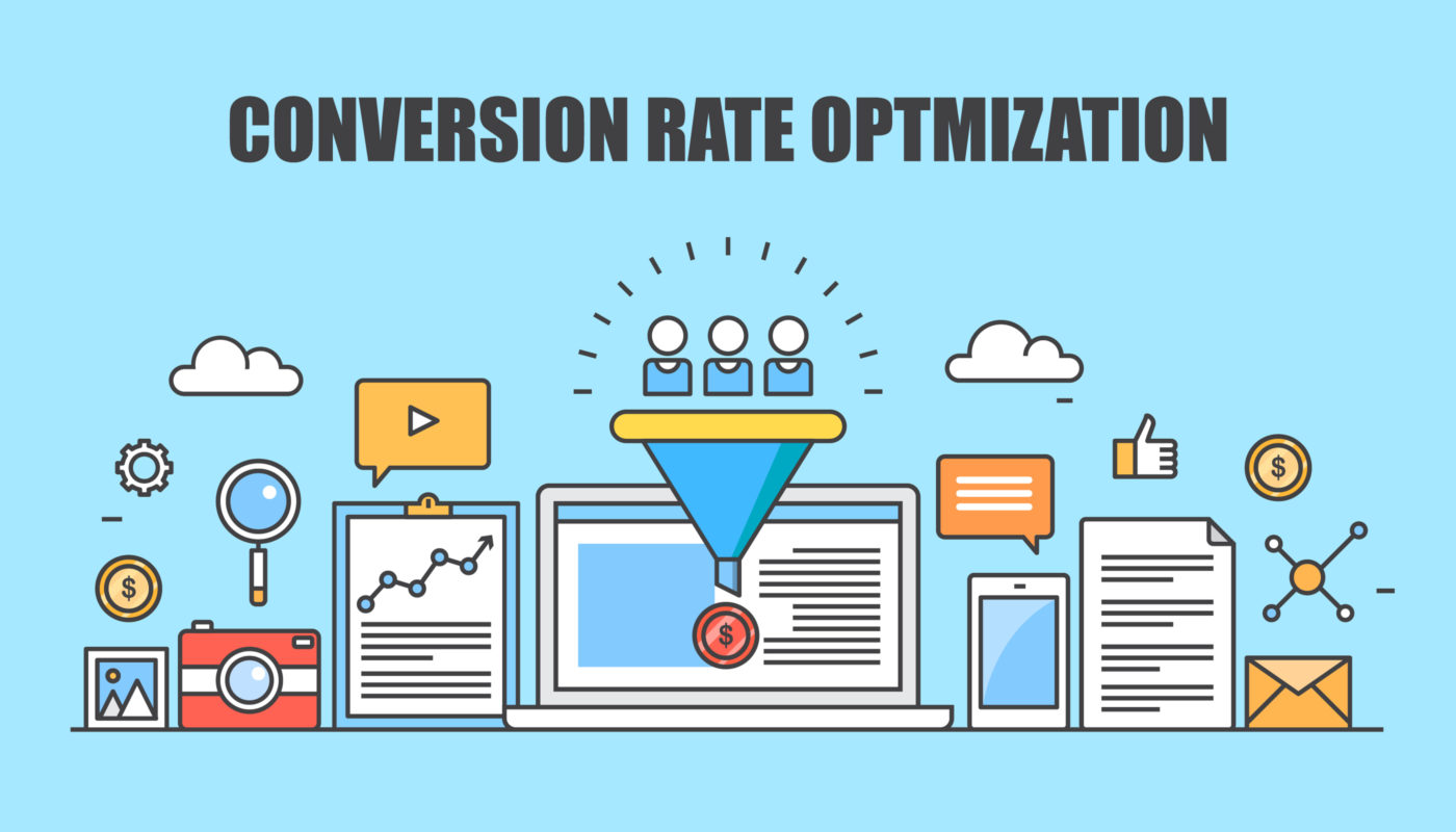
Something which is often overlooked and not discussed much is conversion rate optimization. AKA does your website actually convert when you send traffic to it? This is crucial and you won’t get any real success unless you have this spot on.
You could hire the top Facebook marketing agency in the world and even they would struggle to get subscribers if your website is confusing and isn’t optimized to convert.
When running any form of advertising it is the ad’s job to sell the click and get people over to your website. It is then your website’s job to actually make the sale.
This is really important and small changes can make a massive difference to the number of people you sign up on a daily basis and it can also lower your CPA and save you a lot of money.
I have done a lot of testing on conversion rate optimization for subscription boxes in the last 18 months and at this stage, I can see a clear pattern of what works.
Here’re 5 tips to help you improve your conversion rate.
- The Header
The header is very important because when somebody lands on your website this is the first thing they are going to see. This is your chance to make a good first impression and get that person excited about signing up to your box. When somebody lands on your website for the first time they should be able to figure out exactly what the purpose of your box straight away. Today people have very short attention spans and if this isn’t crystal clear they will click off your site and you will have a high bounce rate.
Remember confused consumers do nothing.
Don’t try to be too clever here. Keep things simple and have a really attractive picture of your box in the header. You should also have a simple tag line that explains exactly what you do in the simplest way possible.
Example:
A Kids Craft Box
Tag Line: A Monthly Craft Box Bursting with Fun Activities to inspire creativity in children.
This tag line is very simple and if somebody came in from out on the street and looked at this website and saw the craft box and this tag line they would understand exactly what is going on straight away. The idea here is to make things as clear as possible so when cold traffic lands on your website you actually have a chance of converting them straight away. If the first impression they get is total confusion they won’t sign up.
2. Pictures of box
If you read any of my Facebook ad posts you will know I am a big fan of recording ads on my phone. This is because it looks authentic and normally converts well. I am afraid when it comes to your website through this is the complete opposite2.
You should really invest in professional pictures for your site. You need to make your box as attractive as possible to entice people to sign up. If your box looks like a pile of junk you simply won’t sign anybody up.
This means the prop boxes you use on your website should all contain really high quality products and look really full. I don’t mean putting boxes up that you will never send out because this is false advertising and it will just come back to bite you in the future. All I am saying is to make sure the boxes look very appealing.
You can achieve this by picking the best boxes you have or will ever send out and get a professional photographer to take the pictures for you.
3. What’s inside section
Do you honestly believe anybody is going to sign up to your box if they don’t have an idea of what they will actually be getting? Think about it logically for a minute. Some of you are trying to sell 6 and 12-month subscriptions. Nobody in their right mind is going to sign up for that amount of time and pay all of that money if they don’t have a clear idea of the type of products you will be including.
That is why you should have a clear what’s inside section on your website. This doesn’t have to be complicated. Just a clear picture of one of your boxes and a brief explanation of the type of products that will be arriving at a monthly basis.
4. Nobody want’s to read a novel.
Don’t bother writing a book on your home page because trust me the majority of people are simply not going to read it and it will hurt your conversion rate. Yes, it is extremely important customers understand what is going on but trust me too much text is actually a bad thing. If you have long paragraphs of endless text on your home page you need to change this.
The first thing you should do is take a step back and try to figure out is all of this text necessary. If it isn’t get rid of it or try to find a way to shorten it. Keep your messaging as clear and concise as possible.
Remember the majority of consumers don’t care about your aspirations or goals they simply care about what you can do for them.
The job of your homepage is to sell your box nothing else. If something is necessary and you are struggling to shorten it you can use other design techniques to get the message across. E.G diagrams and pictures.
5. Social Proof is Key
How much social proof do you have on your home page? If you have nothing then you need to change this straight away. Social proof will dramatically increase your conversions. This has been proven time and time again in so many studies over the years and I know from my own experience it can make a big difference.
Selling a subscription is completely different from selling a once of product. It is a completely different relationship with the consumer, and they really are placing a lot of trust in your company especially if they are signing up for 6 or 12 months. This is why social proof is so important because it will ease the mind of any worried customers.
There should be a section on your website that contains quotes from some happy customers who are signed up to your box. If possible actual pictures of some of your customers with your box will make a gigantic difference. I understand this won’t be possible for everybody. You should try it though and see if some of your customers are willing to do it. You could run a competition to entice them to do it or it would actually be worth it to give away a few free boxes if it would make people agree to do it.
There is a lot more that goes into website conversion optimization but this article will put you on the right path. I hope it helped you realize some small changes you can make to your website that will make a big difference. As I said there are a few different crucial components to growing a successful subscription box company and this is one of them. If you have any questions about conversion optimization or subscription boxes in general please drop a comment below and I would be happy to help.


